We’re back at it again, putting on our goatees and weird hats to bust a myth or two (or five) from the graphics and printing industry. Be prepared to get smarter in 3 … 2 …
1. Print designs are interchangeable with electronic and web designs
One design does not fit all. Web pages use a combo of red, green, and blue (often called RGB) light to create color. Printed parts, on the other hand, use either a combo of teeny-tiny ink dots in cyan, magenta, yellow, and black (CMYK) or mixed pigments (spot colors). Not optimizing designs for their end-use can cause discrepancies between the final product and the intended colors, which is not ideal.
Close-ups of RGB lights from an LED monitor (left) and CMYK dot patterns (right).
2. CMYK print files cannot include Pantones colors
Let’s say you know your graphics supplier uses a digital CMYK printing press to get your jobs done. That means you should set your artwork up with CMYK values, right? Wrong! For critical colors, you need to include Pantone callouts (aka PMS spot colors) in your art. That’s because every press prints CMYK values a little differently. Without those PMS spot colors, you may not end up with the color you want.
3. Every logo can be produced exactly as a pre-spaced vinyl decal
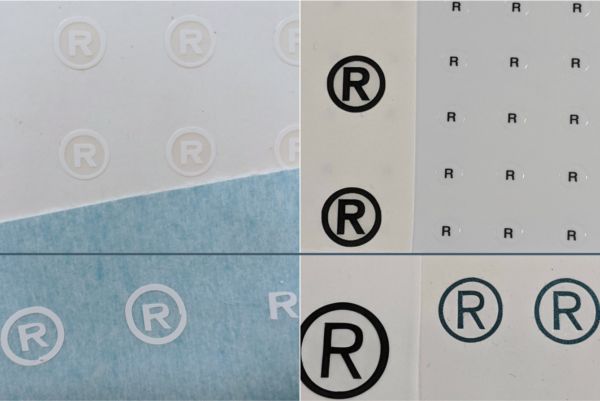
Little designs in logos, including the registered trademark (®) and the plain trademark (™) symbols, often cannot be produced with kiss-cut vinyl because they’re so small. Such tiny pieces will lack the surface area needed to stick and can fall off days after application. To be safe, we recommend that all pieces of pre-spaced decals should be at least one-half inch in diameter. You can also print some or all of the decal on clear material, which will produce the same effect.

The registration symbols above the blue line are easier to read and more durable than the ones below the line because they were printed on clear or white material. The symbols under the line are made from kiss-cut vinyl. They are bigger and look more ragged, but they’re more likely to fall off due to a lack of surface area.
4. File extensions indicate usable art
This is a classic case of “don’t judge a book by its cover.” A recommended file extension does not always equal functional art for your graphics company (follow these guidelines when preparing your art for printers). While some high-res raster files may work for your printer, the best art is always in vector format. You can save raster art in typical vector art formats, so seeing “.ai” at the end of your file name isn’t a sure bet that the art inside is a vector file.

5. Bigger is always better
Outputting your art at the largest file size possible might seem like a good way to keep your art looking pretty, but that’s not always the case. With large-format printing, file size can exhaust computers. Save yourself some sanity—and RAM—when you can. Instead, design at a 10% scale. It will scale up perfectly.
If you have to work with raster art, like photographs, scaling is usually a better option than either compression, which can lower quality, or lowering your resolution. To follow the standard, save at 300 dpi. Sometimes, however, bigger is the only option—say, a giant banner on the side of the building. In those situations, we recommend scaling to one-tenth or one-twentieth of the size while maintaining that 300 dpi resolution. In the end, the size of your project will determine how small you can scale the art, but balancing size and quality should always be the goal.
Pro Tip: To save time and emails, add the scale to your file name to help your printer know what size it should be when they open the artwork.
Feeling smarter? Go ahead and share this post with your friends so they can feel smarter, too. Have some questions, or maybe know another printing myth that should be debunked on our blog? Shoot us an email and get the conversation started. We’d love to hear from you.


