People process a multitude of visual input every second. We take in social media, television, signs, packaging, and more—from the highway to the grocery store—countless times throughout the day. With so much other noise, how can you make your graphics stand out and communicate your message to your audience? The answer is simple: optimization.
“Signs are more than an artistic endeavor,” according to the Sign Research Foundation, which provides academic research on sign strategies, systems, and codes. “The best [signs] blend strong design and graphics with a thorough understanding of the science that makes them most effective.”
Want your graphics to be as effective as possible? Here’s how to do it.
1. Keep it simple
A simple message stands out in the jumble, and it’s easier to process. Key messages can get lost in wordy content, and word-heavy graphics can be overwhelming or intimidating. A shorter message means the words that made the cut will have more of an impact.

This Kroger billboard shares a clear, enticing message in less than 10 words. (credit Austin DeJonge)
Two tips to keep your messages brief:
1. Use active voice.
That means something should be doing something. For example HOT! Do not touch is in active voice, a brief version of You shouldn’t touch this item because it is hot. If that simple message were written in passive voice, it would read This hot item should not be touched. Wordy, awkward, and stuffy.
2. Avoid prepositions and pronouns.
Again, consider HOT! Do not touch, and look how clunky it becomes with prepositions (because) and pronouns (you): You shouldn’t touch this because it is hot.
Another way to simplify a graphic is through artistic design. Too many design themes or elements can compete for attention and distract from the overall message. If your graphic is part of a set, simple and cohesive designs will also help the consumer connect the messaging.

Yellow road signs prepare drivers for specific road conditions and hazards, while green ones provide guidance and directions. This simple design system assures drivers know where to find the information they need. (photo source)
2. Use symbols instead of words
One way to increase message comprehension is to introduce familiar symbols. The more you use those symbols, the more recognizable they become. Think of fast-food chains like McDonald’s, KFC, and Dairy Queen. Their logos (which are a type of symbol) are so recognizable, the restaurants no longer need to list the food they sell on signage. The logos are enough for consumers to identify the brand at a glance.
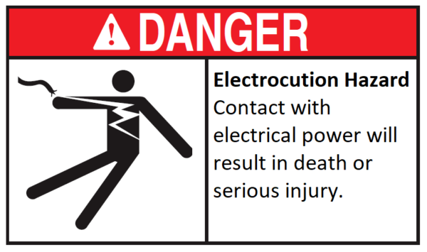
Images can also cross language barriers and communicate a message faster than text. Consider arrow signage that points where to go and silhouettes to indicate actions, such as in the image below. How quickly a viewer can understand your message can be vital, even lifesaving. For example, this label uses the silhouette of a person holding a broken power line to warn of danger.
3. Choose a clean font
Fonts can play an integral role in both the readability of your graphic and consumers’ opinions of your brand. Typefaces should be legible and compatible with one another, giving the impression you want potential customers to have of your company. For example, a modern, tech-forward computer company wouldn’t select a scripted or elaborate font as The Washington Post uses. (Learn more about fonts in this handy blog post.) Similarly, a company like the Post, which wants to celebrate its history and years of knowledge, wouldn’t care about its font being trendy or modern.

4. Colors matter
Colors can make or break a design. To catch a consumer’s attention, use bright, vibrant colors. To invoke the feeling of professionalism, use muted colors. When selecting the best colors to use, consider the connotations and emotions associated with each color. For example, red can represent the word “stop” or danger, as well as feelings of love and romance.
Many industries have specified color guidelines, such as warning colors set by the American National Standards Institute, and some companies have brand-specific colors that must be used for all marketing projects. This creates a cohesion that becomes recognizable for consumers. For example, think how odd it would be if Coca-Cola cans used the wrong ink and produced cans that were pumpkin orange or maroon instead of that bold, recognizable red.
5. Keep graphics visible
Graphic usefulness is largely tied to where the graphic is displayed. For maximum effectiveness, select the most visible location possible, and then design your graphic accordingly. For example, large signs are often viewed from a distance and require large text, few words and highly contrasting colors to maximize visibility. Smaller graphics, on the other hand, are often viewed closer up and can afford to be wordier or incorporate more muted designs.

Grocery stores are a great example of a place with optimized signage locations. Categorical signs direct consumers where to find what they need, using few words and large, high-contrasting text. (photo source)
In summary, optimized graphics not only capture a consumer’s attention but communicate essential information clearly and quickly. The perfect design stands out to the viewer and effectively conveys the intended message without confusion.
Whether you have any questions about how to efficiently communicate your message or you have a design completed and are ready to go to print, Graphics Output is happy to assist. Request a quote online, shoot us an email, or call 260-748-0577.

