Advancing to “Color Expert”
Today, we venture into the scientific side of color and how to combat personal subjectivity when matching printed colors. In case you missed them, the past two blogs in our color matching series we covered the basic terms of color matching and how each process and material can affect the ability to achieve the best color.
Matching Color – Lighting and Metamerism
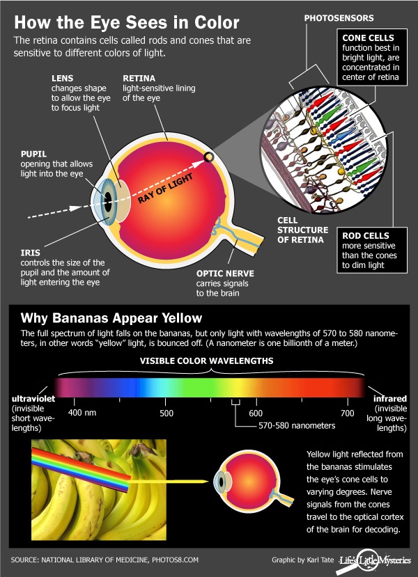
How you view a color will depend on where you are, where the color is that you are looking at, and how the light in the environment is hitting the object. That means that two people in the same room looking at the same object could see slightly different colors, merely due to the angle at which they are viewing it. If you aren’t familiar with how our eyes interpret color, take a moment to review the diagram below.
Metamerism is not a widely used term, but it is an important one. It explains the differences in color when various light sources are applied, such as daylight, fluorescent lights, or tungsten halogen lights. In the most basic sense, metamerism explains why sometimes a color will appear to match it’s color standard and sometimes it does not. It all has to do with the current lighting environment and how the light waves are being reflected into our retinas. Wyszecki & Stiles studied metamerism in their 1982 “Color Science” study1. In their research, they broke down metamers into two categories: perceptual and psychophysical.
![]() Perceptual metamers are two color stimuli that have different spectral radiant power distributions, but are perceived as identical for a given observer.
Perceptual metamers are two color stimuli that have different spectral radiant power distributions, but are perceived as identical for a given observer.
Translation: The two colors are physically different, but they look the same in the current environment.

These tomatoes are not the same as a bell pepper, yet they both look the same color in the right lighting.
![]() Psychophysical metamers are two color stimuli that have the same tristimulus values, but different spectral radiant power distributions.
Psychophysical metamers are two color stimuli that have the same tristimulus values, but different spectral radiant power distributions.
Translation: The two colors are physically the same, but they look different in the different environments.
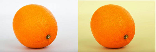
This is the same orange, but it looks like a different shade when viewed in a bright, white light, versus a soft, yellow one.
Metamers can make color matching VERY difficult, so how does one get around those difficulties? Printers like Graphics Output use special tools including spectrophotometers and light booths, which allow the color technicians to measure color only when certain lighting is applied. Most use “daylight” simulated lighting. This means that if you do not look at a color match in the lighting environment used to match your color, it probably won’t look correct.
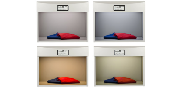
A light booth from JudgeQC showing off the same clothes in different lightings.
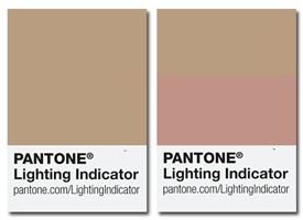
To make sure you view your parts in the correct lighting, Pantone has created lighting indicators with two color patches that match when lighting conditions are ideal and mismatch when lighting is poor. If you do not have a photobooth, going outside into the sun is the best option.
Get your free lighting indicator. Limited to one per company.

Measuring Color – The Science of ΔE
Spectrophotometers are devices used by the printing industry to turn colors into numbers. This makes subjective visual color-matching completely objective: If the numbers are correct, the color should be correct.
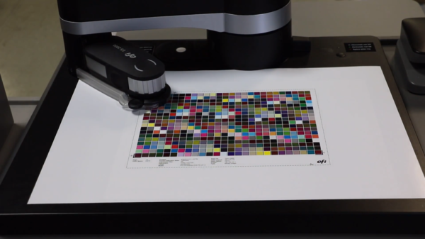
An X-Rite iO spectrophotometer scanning a printed color profile. Source: Steve Johnson, YouTube
Once two colors have been scanned and given numeric values by a spectrophotometer, the difference between them can be measured in units of ΔE (Delta E). A ΔE of less than 1 is not perceptible to the human eye, while a ΔE of 100 means the two colors are the exact opposites. For colors that aren’t important (for example, non-brand specific colors, or even when you want cut vinyl to match your brand color, but really don’t want to pay an exorbitant amount for a custom-made vinyl), a ΔE of less than 5 (perceptible at a glance) is a common tolerance standard. For fairly critical colors, such as brand specific colors on overlays and decals, a ΔE of 3 or less (perceptible through close observation) should be specified. Colors that are extremely critical, such as logos for major brands and Fortune 500 companies, may have an acceptable ΔE tolerance of 1 or less.
It is useful for color specialists to use light booths in combination with spectrophotometers, especially in the case of subsurface prints (remember that window we were looking at the paint through?), because the thickness, cast, and texture of the material can all affect the way that light bounces in the device, leaving us with inaccurate numeric data. Often the ink itself is matched without regard to the material and then tweaked via visual color-matching as needed.
Whatever color standard and tolerance you decide on, Graphics Output is here to help you get your color right. We are happy to sit down and go over options to find what fits your needs. Email us at sales@gographicsoutput.com, call 260-748-0577, or request a quote here.
1Wyszecki, G. & Stiles, W. (1982) Color Science, 2nd Ed. NY: Wiley & Sons
See also Color Matching 101 – The Essentials and Color Matching 201 – Beyond Basics.

