I want that color! Now how do I get it?
In the first blog in our color matching series, we covered the basic terms of color matching. Besides knowing the lingo, choosing the right printing process and material can affect the ability to achieve the ideal color when trying to select brand colors.
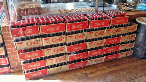
Photo Credit: Jac Malloy via Flickr
The Importance of Color Matching
Some colors don’t matter as much as others. The shade of white of a piece of copy paper isn’t very important. But consider the specific red of the Coca-Cola logo – that’s vital to the company. Brands often use many different forms of media – digital, newspapers, magazines, labels, graphic overlays – and companies need to know their colors will be accurately represented. Printers must “color-match” those tones on their presses, which allows companies like Coca-Cola to use one standard “Coca-Cola red” on their cans, boxes, and plastic bottle labels, regardless of how many suppliers and print-processes it uses.
Standardizing Color
All color-matching must be done to a color standard. This standard can be from a physical object such as a piece of fabric, plastic, painted metal, or previously printed part or a standardized color system, like the Pantone Matching System. Once a color standard has been chosen, companies will need to supply it to a printer for matching.
Printing Color
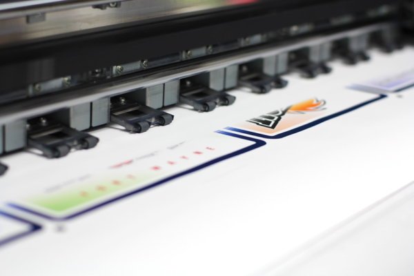
There are many ways any one label, decal, or overlay can be printed: thermal, digital CMYK, screen, offset… even inkjet printing on your home printer is an option. The print process can determine (and limit) the color options of a product. For example, thermal printed parts have a specific set of color ribbons that can be used. While those colors can be layered over one another to create new colors, the product specifications make color-matching impossible for thermal printing. Either “close enough” is good enough, or the part needs to printed using another method.
CMYK digital printing has a larger color gamut than thermal printing, but a more limited color gamut than screen printing. This is because the process merely tricks the eye into seeing one color by using lots of tiny cyan, magenta, yellow and black dots, where screen-printed ink colors are created directly from pigments. CMYK digital prints can even vary digital printer to digital printer because the size of the dots and the hues and saturations of each ink used by each printer are usually different. For example, a simple Google search for “CMYK Values Coca-Cola Red” leaves you with multiple options:
Cyan 0
Magenta 88
Yellow 90
Black 7
Cyan 4
Magenta 100
Yellow 95
Black 0
Cyan 0
Magenta 100
Yellow 96.3
Black 4.3
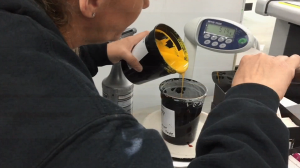
Maybe none of those are correct for the printer it needs printed on. The pressman must make adjustments to the color files before printing a job, making sure they match. Alternatively, a screen-printed color would simply be 100% (custom mixed) “Coca-Cola Red”.
You should always speak with your graphics supplier on what color options are available for any desired material or process. Pantone even makes different PMS books for various printing processes. Keep in mind that most PMS colors will not be printed on the same material as the PMS book itself, which can affect the possibility of hitting a color with a certain material. Pantone even makes books that can compare spot colors and CMYK colors, so that you know the closest you can get to a PMS spot color:
“Oftentimes, a spot Pantone Matching System color is requested when creating a process-printed piece. To save money, the spot color should be evaluated to see how it will look if printed in CMYK. While some colors can be simulated well, there are many that are outside the possible color gamut for that process and will look quite different. As the quality of the resulting color conversion is very subjective, the designer can make decisions using the Pantone Color Bridge guide, as well as a Pantone Extended Gamut Coated Guide.” –Pantone.com
Subsurface (second-surface) printing throws additional factors into the color matching mix. Subsurface printing is achieved by printing in reverse directly on a transparent or translucent material, usually polycarbonate or polyester. The result is much like painting one side of a window and then looking at the paint through the other side.
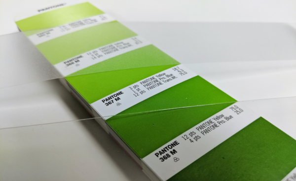
A subsurface print is simulated by placing transparent polycarbonate pieces over a PMS swatch book.
The color of a subsurface print will be affected by how thick the material is, how transparent it is, if it has a texture, and if it has a slight gray or yellow cast. Because of this, it is a good idea to check with your graphics supplier to see what color options are available for any process or material before selecting a color standard.
Whatever color standard you decide on, Graphics Output is here to help you get your color right. We are happy to sit down and go over options to find what fits your needs. Email us at sales@gographicsoutput.com, call 260-748-0577, or request a quote here.
See also Color Matching 101 – The Essentials and Color Matching 301 – Measuring Color.

