Back to the Basics – Learning Your Colors
Have you ever gotten a printed part that just didn’t look right? A likely scenario is that the part was not accurately color matched. Maybe it didn’t match the brand colors in your logo. Or maybe your current supplier’s parts don’t match your old supplier’s. Which company printed the right color? How do you even know? Welcome to the Graphics Output crash course in color matching. In this three-part series, we will explore how each printing process and material can affect color, as well as how lighting and perception can play a huge difference in your color match results. Let’s start by sorting through all those crazy terms and acronyms that get thrown around when talking color matching.

CMYK – An acronym that refers to the printing process used in most digital color printing with four inks: cyan, magenta, yellow and key (black). When the colors are combined on paper (they are actually printed as small dots), the human eye sees the final compound image. Also referred to as the “4-color process.”

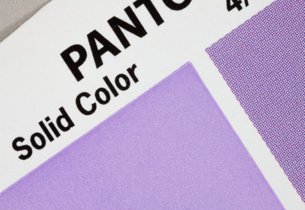
A super zoom photo of a solid “spot color” purple, next to a CMYK version of the same color. The CMYK dots that make up the purple hue on the right are visible only if you observe very closely.
Spot Color – A solid color, often used to refer to a non-standard or custom-mixed ink. It is used most often to refer to colors in offset and screen printing, but the term “spot color” is also often used to refer to a “PMS color”.

White screen print ink, used as a “spot white” during the printing process.
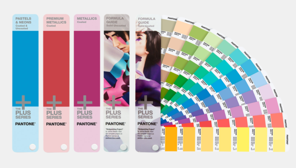
PMS – An acronym for “Pantone Matching System,” a standardized color-matching system developed by Pantone and used widely in the graphic design and printing industries.

Source: Pantone
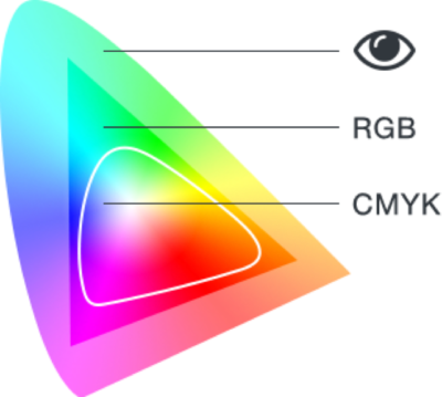
Color Gamut – The subset or range of colors that can be accurately represented in a given circumstance, such as the possible range of colors that can be printed using the CMYK print process.

Source: Wikipedia
Spectrophotometer – A device used to measure color by recording the intensity and wavelengths of light on the color spectrum.
These devices emit a specific wavelength of light at a specified angle, and then measure the reflecting wavelengths of light. This allows for the variables found when color matching, such as the source and strength of the light and how the viewer is looking at the color, to simply disappear.

A Graphics Output color specialist scanning swatches with an X-Rite i1 spectrophotometer.
ΔE/Delta E/dE – A metric used to understand how the eye perceives color differences. In essence, it’s the measurable difference between two colors. A ΔE less than 1.0 is imperceptible to the human eye.

The oranges on the right appear lighter. Changes in color including how dark or light a shade is or how red or green a shade is all contribute to the ΔE between two colors.
Graphics Output is here to help you get your color right. We are happy to sit down and go over options to find what fits your needs. Email us at sales@gographicsoutput.com, call 260-748-0577, or request a quote here.
See also Color Matching 201 – Beyond Basics and Color Matching 301 – Measuring Color.


