Tips for Creating Safety Labels
Creating a new safety label from scratch can seem like a daunting task. Whether the information is for end-users, service technicians, or your own employees, a well-designed safety label will help to keep people safe and informed and will help cover you in a liability case.
The first step to creating a safety label is to decide on the specific warning. These safety labels are designed to warn people against specific hazards and personal injury – to warn of fire dangers, hand-crushing machinery, electrocution hazards, and more. Once you have a general idea of the warning you want to produce, the next steps will be choosing the appropriate wording, getting the correct punctuation and positioning, and selecting the correct header bar design.
Wording
Be specific
A safety label is not the place for generalizations or words that are “open to interpretation”.
Use “Action-Oriented” phrasing
Use active voice instead of passive voice.
Use commands
It may be helpful to think of yourself as a military officer. What command would you use for immediate compliance?
No prepositions
There is no need for these – if you have one, find a way to reword your sentence.
No pronouns
Pronouns, especially “you” should be eliminated to keep messages clear and concise.
Start with the most important Information
If labels have more than one sentence, the first sentence should give the main message.
| Instead of this… | Use this! | Why? |
| HOT! Please do not touch unless part is not being used. | HOT! Do not touch while in use. | “Please” is not a command “Unless” is a preposition “Is not being” is passive voice |
| You must wear proper safety attire. | Safety goggles must be worn when operating machine. | “You” is a pronoun “Safety attire” is not specific “When operating machine” outlines specific circumstances |
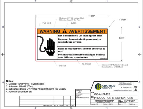
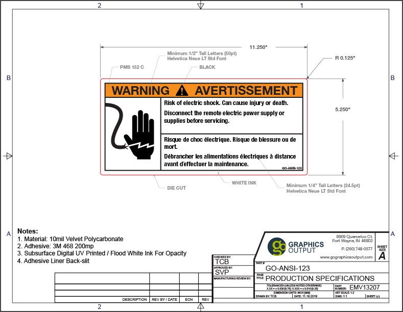
Punctuation & Positioning
- Do not use any punctuation in the colored header bar.
 Note: An exception is an exclamation point inside a triangle at the left-hand side of a “DANGER”, “WARNING”, or “CAUTION” header. This triangle is also referred to as a “safety alert symbol”.
 - An exclamation point may or may not be used in headline/first sentence.
Overuse of exclamation points will lessen the effect, so use sparingly and only for very important messages. As most text is a command or information, a period is usually acceptable. - Label text should be left justified.
- Text should be large enough to be easily legible, and both upper and lower-case letters should be used (i.e. don’t leave your CAPS-LOCK on).
- Any safety-specific symbols should be to the LEFT of the warning text.
Colored Header Bars
When deciding on which header bar to use, the use of an already established bar/color system is recommended.
Below are some examples of popular color codes.
OSHA Color Codes & Signal Words
| Red | DANGER |
| Orange | WARNING |
| Yellow | CAUTION |
| Fluorescent Orange/ Orange-Red | BIOLOGICAL HAZARD |
Source: Occupational Safety & Health Admin. 1910.145(f) App A
ANSI Color Codes
| Red | Fire protection equipment and apparatus, danger signs, containers of flammable liquids, lights at barricades, stop button/switches |
| Orange | Signs and equipment designating dangerous or energized machines/equipment |
| Yellow | Specific physical hazards (including falling, tripping, and striking) and designating caution (including cabinets, cans and containers for explosives, corrosives or unstable materials) |
| Green | Safety information and first aid or safety equipment information |
| Blue | Information not immediately safety-related (i.e. property policies including safety gear requirements) |
| Purple | The significance of purple may be defined by the end-user, but purple (or the combination of purple and yellow) has become the de facto standard for radiation hazards. |
| Grey Black White and Combos of Black, White, and/or Yellow | The significance of these colors may be defined by the end- user |
American National Standard for Safety Colors, ANSI Z535.1-2017
For more information on current ANSI-approved PMS colors, check out our awesome digital download guide here.

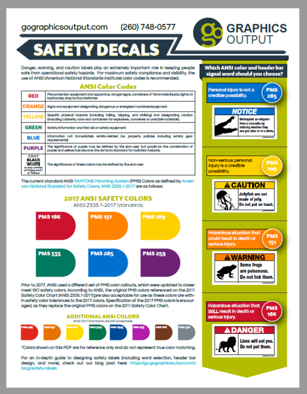
Signal Words for Header Bars
If you are conforming to ANSI safety label standards, the header design and signal word you should choose will be fairly straightforward. See the flowchart below to help you decide the correct design and signal word for your header bar.

Put it all together, and that’s it! You now have a brand new safety label. Well, almost. Now that you have your label designed, it’s time to go to print.
")
If you need a quote or just want a second look at your new design, don’t hesitate to reach out to us by emailing sales@gographicsoutput.com or calling 260-748-0577.