Which font should I use?
Figuring out which font to use for your brand, logo, or document can be difficult. And why not? There are over 700,000 fonts in existence, according to What Font Is. How can you possibly narrow down your options when the pool to choose from is so huge?
Every typeface has a different personality, so choosing one that is appropriate for your brand, product, or design goal is key. A designer fragrance, for example, would use a different font than the label on organic fabric soap. Plus, understanding your audience members and their preferences will help you choose the type that will be the most successful.
We’ve compiled a simple glossary to help you get started.

Typeface: “Typeface” is a sort of umbrella term that covers the design or look of your letters and numbers. Times New Roman, for example, is a typeface. So is Comic Sans. And Futura. And Ariel.
Font: If you take your typeface and add weights (the thickness of your letters or numbers) and styles (such as the character’s size, if it’s bold, or if it’s italic), you get a font.
If the difference between typeface and font is still confusing, Pixels Ink gives a great metaphor on his YouTube channel: Consider typeface like a music album called, for example, Futura. The track list on the back, then, are all the different kinds of Futura fonts: Futura Medium, Futura Medium Oblique, Futura Condensed Medium, etc.
Serif: A serif typeface is a design that includes serifs, which are the small “feet” you see on individual letters, and the one below, which is Adobe Caslon Pro. Serifs can make small fonts difficult to read, but in general, they are known to promote readability; this is why so many novels use a serif typeface.

Sans serif: A sans serif typeface, meanwhile, does not have serifs, or the “feet” on individual letters. This style is used in clean, simple designs and has a more modern feel than its serif counterpart. Sans serif typefaces, like Univers, seen below, are often uses in warning labels. Sans serif typefaces work better digitally because some finer serif typefaces become pixelated or jagged at small sizes.

Handwritten: Handwritten typefaces are made to imitate handwriting and often give off a down-to-earth or whimsical vibe, as seen in ITC Dartangnon, below.

Script: Script typefaces are a branch of handwritten typeface. They mimic ornate penmanship, as seen in Commercial Script, below, and are often cursive and calligraphic. Using a script typeface can elevate text, making copy seem special or elegant.

Fantasy/decorative: Fantasy and decorative typefaces are mostly picturesque. They often include images and can be difficult to read. Wingdings and Broadway are both pictographic examples, as is ITC Beesknees, below. Decorative typefaces might mimic graffiti or use unorthodox letter shapes and sizes. They can work well for large headlines with few words.

Typefaces and Your Brand Identity
Finding the perfect typography for your project can be fun, but keep in mind that you need to approach it with a specific goal in mind: To find two or three typefaces that represent your brand. You might use one version of a typeface (or a font) for your logo and another for your headers. You’ll use one version (or font!) for your default type and another as an accent.
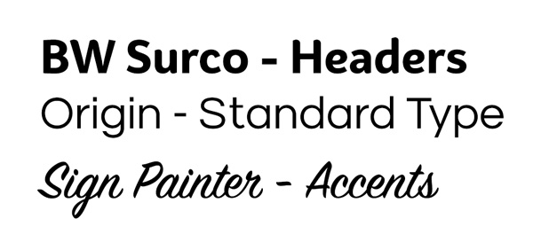
Consider the typefaces we use at Graphics Output. For everyday use, we use three:

- BW Surco: We use these for headers, such as a headline on our website or blog post.
- Origin: This is our standard typeface. It’s what we use for general copy on brochures or online, for example.
- Sign Painter: This is our accent typeface. We’ll use this, for example, when we want to add some flair.
Your complementary typefaces should be legible, work well together, and give the impression you want potential customers to have of your company. Consider, for example, a résumé: Garamond or Helvetica can give your résumé a clean, simple, polished look. Wingdings, on the other hand, will make your résumé look like a 3-year-old created it.
Once you’ve narrowed down your options, create a mockup to help your team make an informed choice. When you’ve selected your company-approved typefaces, save them in a brand standard guide. This guide—which should also include the official company logo files and approved company colors—should be given to new employees or anyone who has a hand in reproducing your brand.

If you have any questions about developing your company’s branding or deciding which typefaces will work best for your labels, Graphics Output is happy to help. Shoot us an email, reach out on the web or call us at 260-748-0577.


