Creating Successful Trade Show Graphics
Let’s be honest: Trade show displays can be a pricey investment. However, a successful weekend with a great booth can drive a substantial amount of new sales to your company; the more prospects you find, the less you’re going to mind that investment. Here are five effective tips for designing high-impact trade show graphics.
 Attention-grabbing Color & Quality
Grabbing potential customers’ attention is key when it comes to trade show graphics. Bright, popping colors give life and variety to booths. Color can direct attention¹ and increase the potential to convert images to long-term memory. To keep your booth cohesive and professional, color palettes should reflect your company’s brand colors. A tip: Trade show floors are a mess of chaos. Choose one- or two-color displays to stand out in the bustle.
And don’t skimp on quality. Signage should be crisp and clear, so make sure all image files are high-resolution. Bonus points if you can display signs in a creative way.

The Jelly Belly booth colors are vibrant and eye-catching.
 The Vertical Advantage
Since adding height to your displays increases their visibility, your company name and logo should always be placed near the top to help properly identify your booth. Notice the word “near” – It’s true, your name does not have to come first. Use a tagline under or above your company name, especially if it is not well-known in the industry or does not describe what your company does. A tagline can make your services clear to attendees. Consider one that highlights your most impressive feature, such as “best book-selling booth here” or “fastest digital cutter in the industry.”

The World First booth uses size to its advantage. Due to its height, attendees can see the company’s name from far away, as well as its tagline.
 Simplicity is King
Effective trade show graphics are simple and easy to read from far away. This means they should be large enough to be read easily, all fonts should be legible, and busy backgrounds should be avoided.

This Beyond Meat booth uses simplistic font, colors, and style that immediately indicate to the attendees that their company provides food products.
 Stay Proportionate
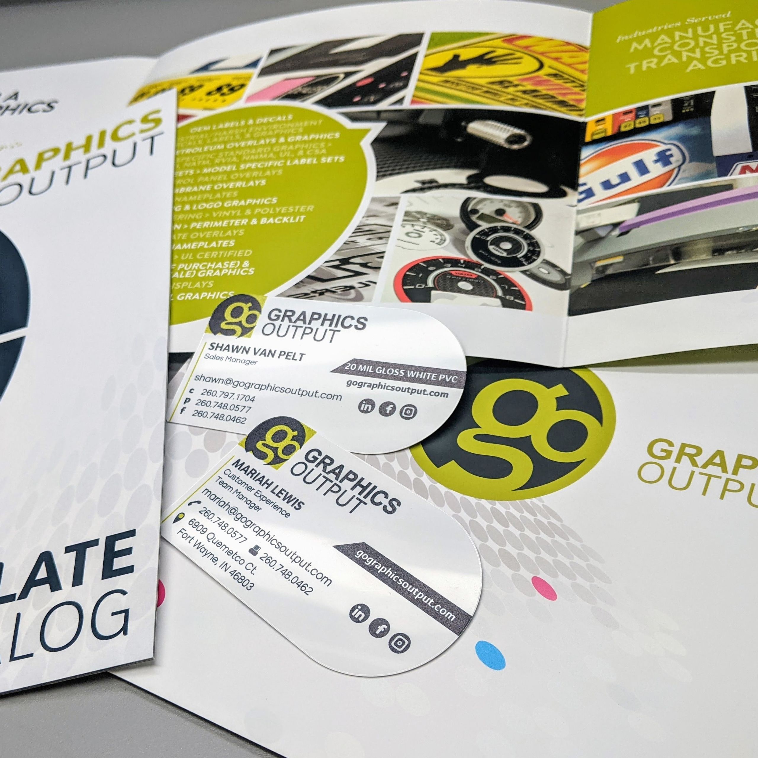
Attendees will see larger signage from farther away and should focus on larger, big-picture points. That means less text, larger font sizes and graphics–and less overall detail. Smaller signage seen from up close can include more details such as bullet points or charts. Save the most detailed information for small items such as tri-folds, fliers, or business cards.

The QI ICT booth uses multiple sized fonts which allow for a clean and stylish appearance that still provides all of the proper information for the audience.
 Go With the Flow
Early on in the design phase, consider how your booth will flow. Try to find out where you will be located at a show. Are you near the main aisle? In a corner? Stuck right in the middle of everyone? Create layouts based on how potential customers will see your booth and how they can move across or through it. Identifying main focal points can help when layout planning seems overwhelming.
Displays and hardware throughout the booth should always compliment each other, and information should be laid out in a way that tells your booth visitors a story.

This Splashtacular booth has an interesting design that encourages attendees to enter. While walking through the exhibit, information is accessible at main focal points.
If you are ready to take the next step toward an iconic display, contact our sales team for your free consultation today. We can help design your booth, print the graphics, or take care of it all. Email us at sales@gographicsoutput.com or call 260-748-0577.
¹Dzulkifli MA, Mustafar MF. The influence of colour on memory performance: a review. Malays J Med Sci. 2013;20(2):3-9.
